Ölfusborg
A building tradition becomes a brand.
An identity drawn from the topping-out celebration: the moment a building’s final beam is placed. The client’s reference was the Polish Wiecha tradition, with related celebrations in Iceland and Denmark.
An emblem with a building tradition inside.
The Polish Wiecha celebration was the client’s starting point: the final beam, tools and celebratory foliage become one illustrated emblem. The identity carries a story about craft and the moment a building reaches its full height.


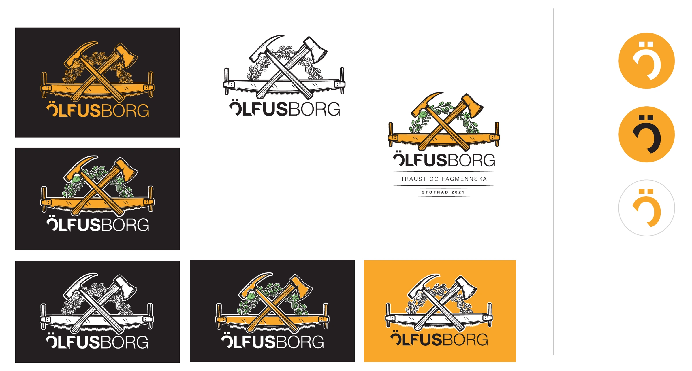
Rich in detail. Flexible in use.
The full illustration has a colourful expression. Gold, black and single-colour versions let the same identity work across different backgrounds and formats.
The quieter expression.
A gold emblem on a dark surface brings out the drawing and the linework.
The everyday identity.
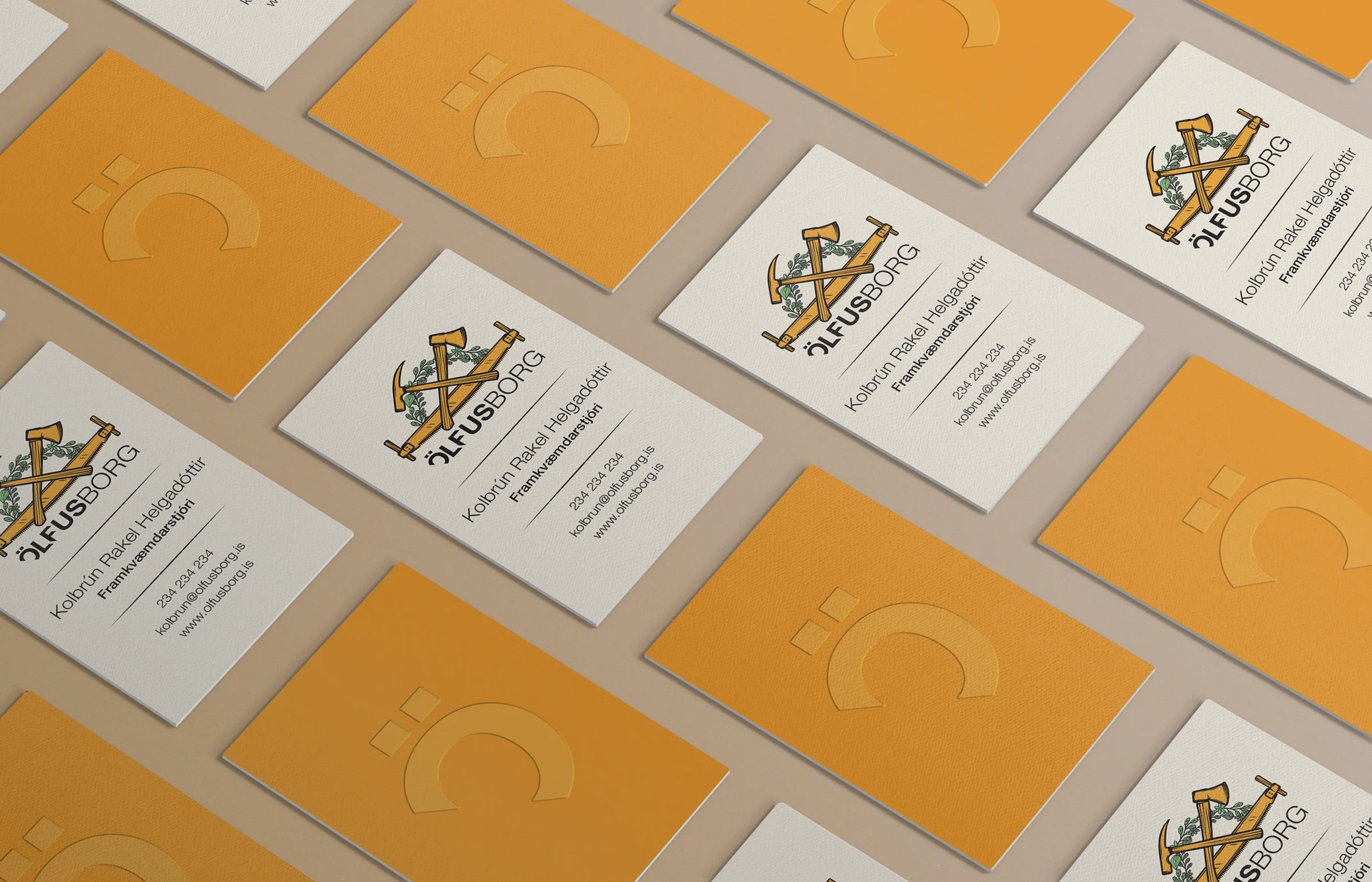
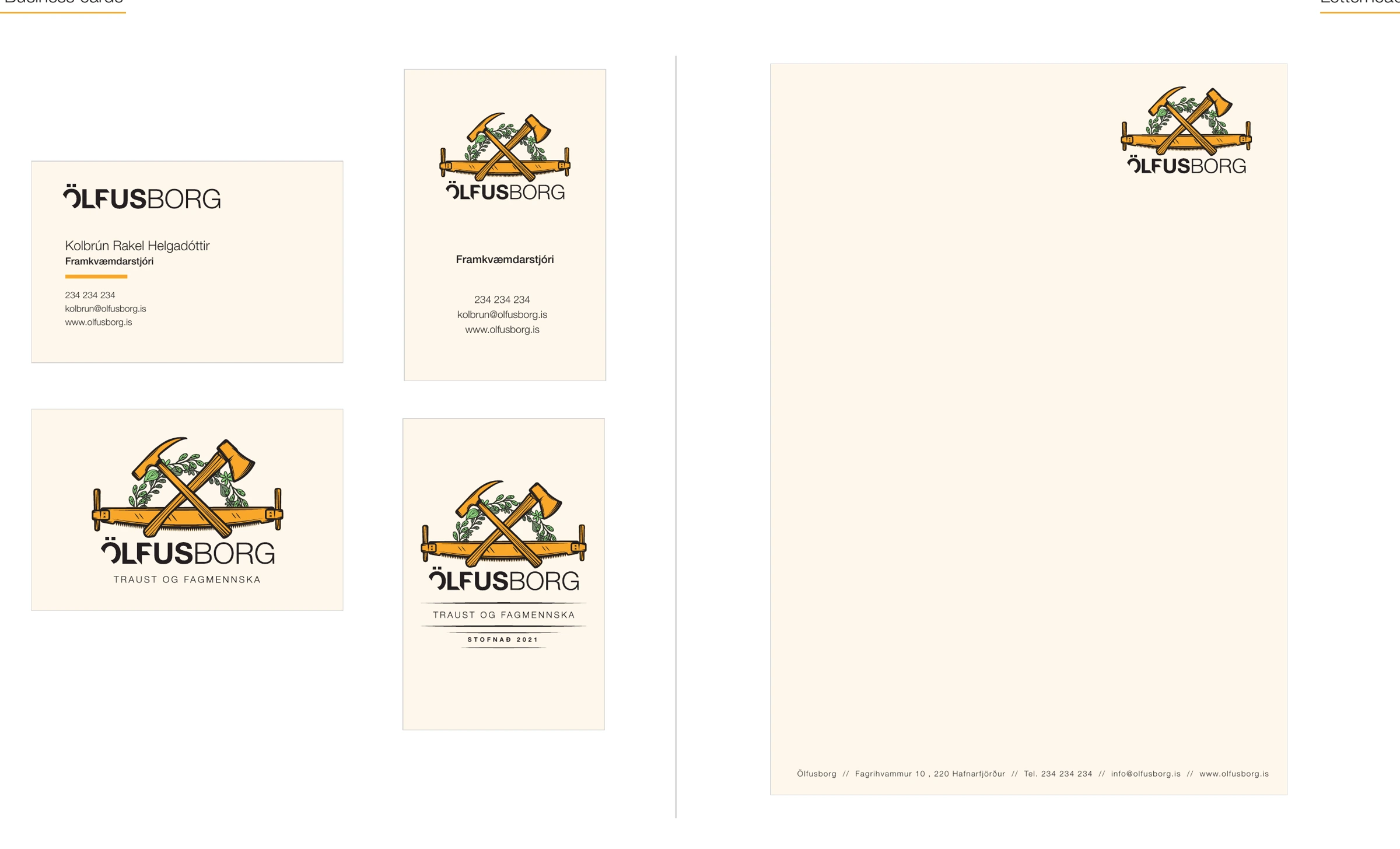
Business cards and stationery carry the company’s story into everyday correspondence. Warm paper tones give the illustrated emblem room to breathe.
Illustration, modified typography and identity by Björgvin Guðjónsson. Published in 2021.
Also on Behance ↗