Orkustöðin
Strength. Balance. A view of the sea.
An identity for a fitness centre by the sea in Iceland. Orkustöðin brings training and wellbeing together under one flowing teal mark, with a visual language that moves from the logo to communication and the physical space.
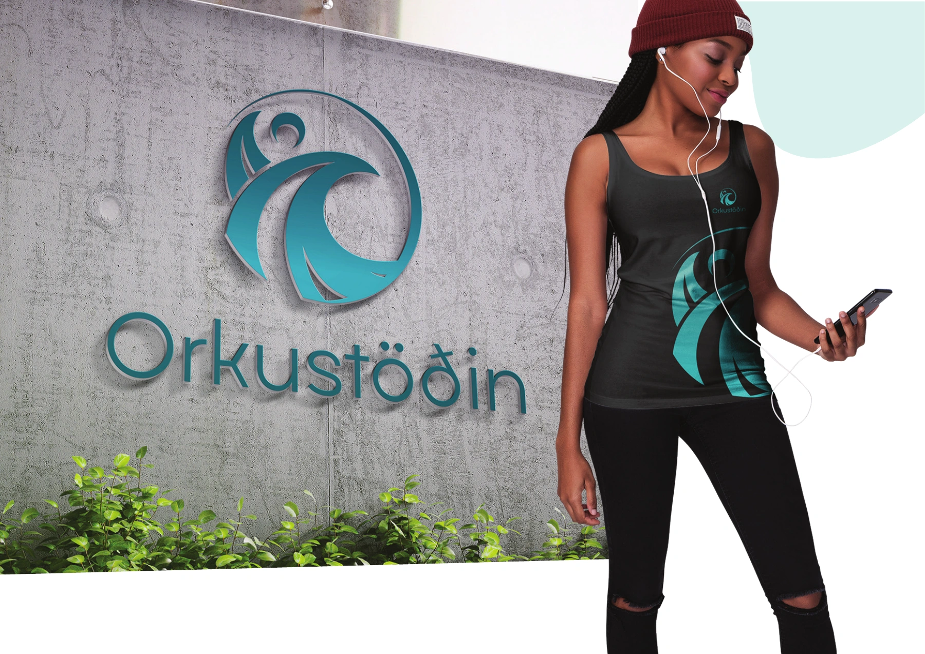
Strength, balance, wellbeing.
Styrkur – Jafnvægi – Vellíðan. The signature brings a light wordmark together with a circular, flowing figure. The symbol carries a sense of movement without losing its calm.
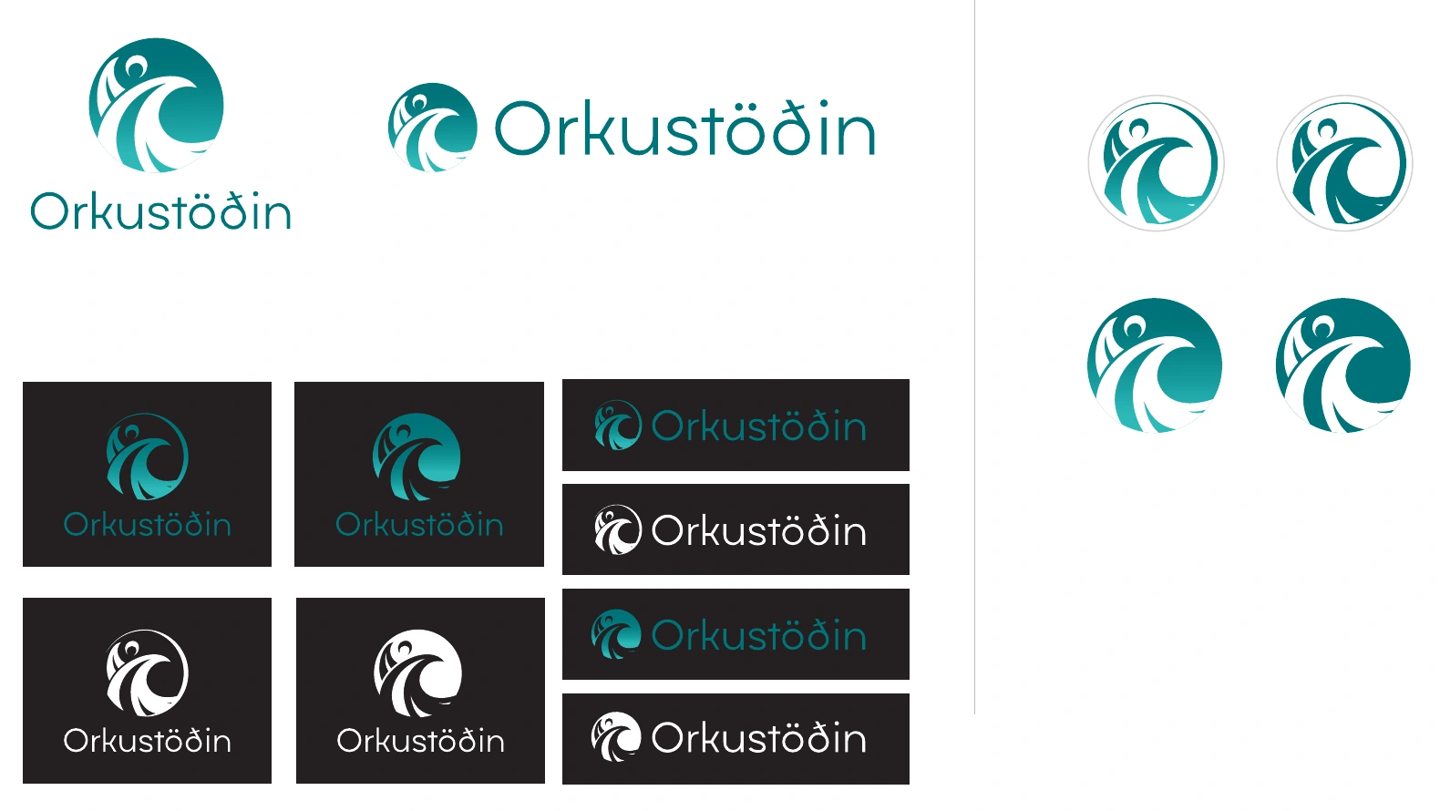
One identity. Several ways to move.
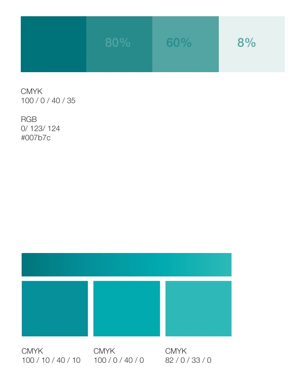
Vertical and horizontal signatures, compact profile marks and reversed versions keep the identity recognisable across formats. Teal and lighter related tones give the system its visual continuity.
Movement becomes a visual language.
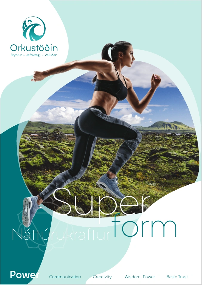
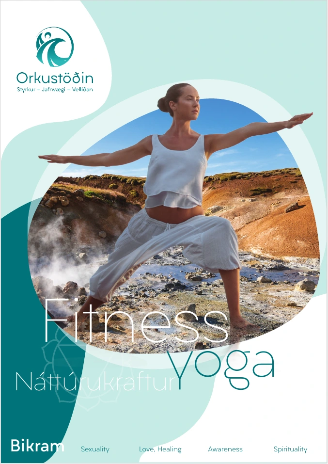
The key visuals connect fitness and yoga with Icelandic landscapes. Large curved shapes echo the symbol, while the same identity extends into signage and clothing concepts.
Energy inside. The sea outside.
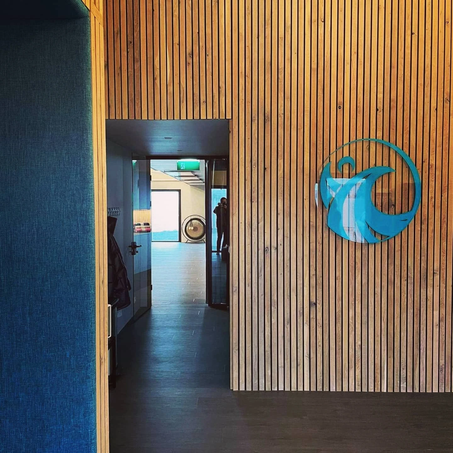
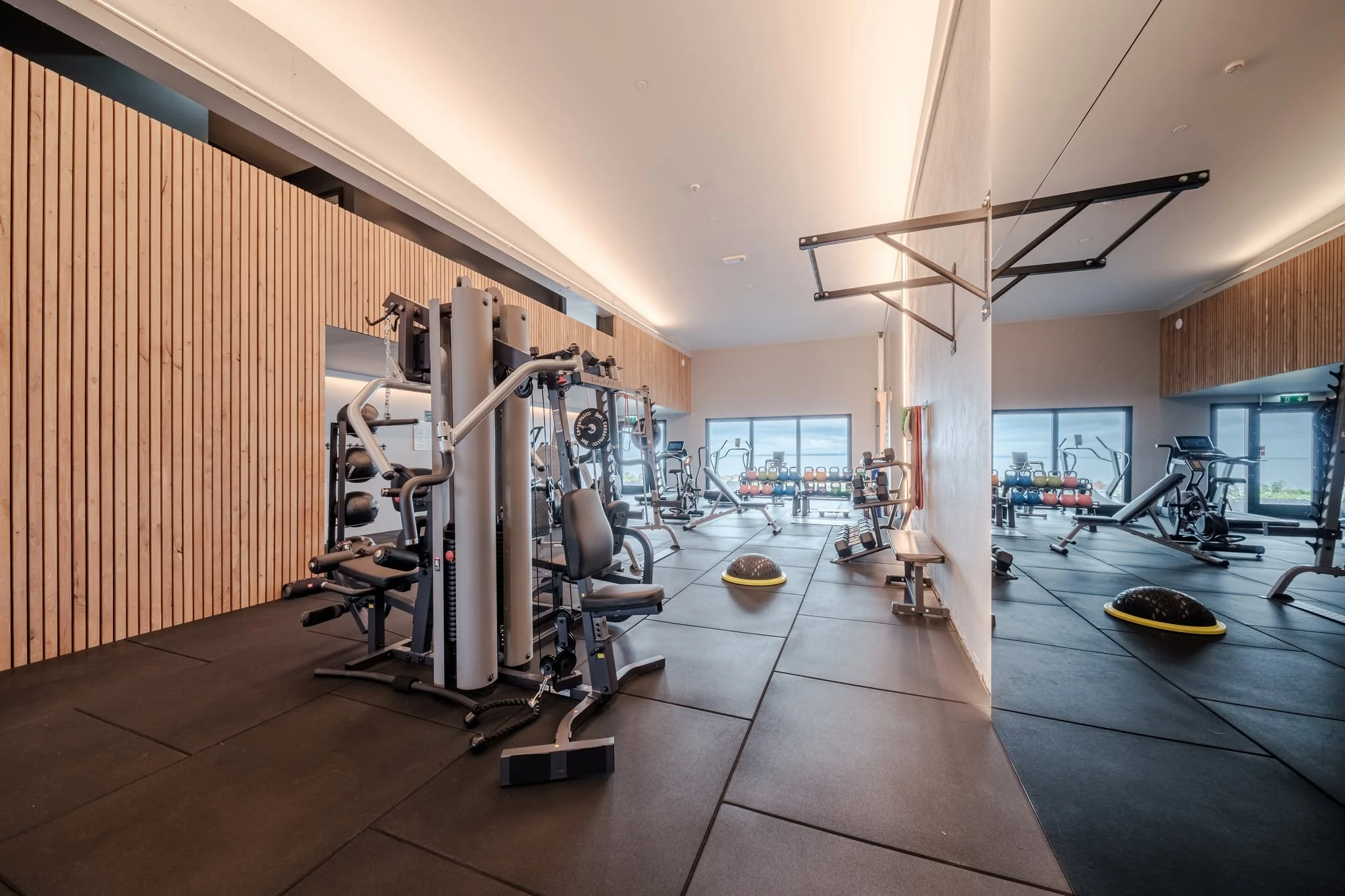
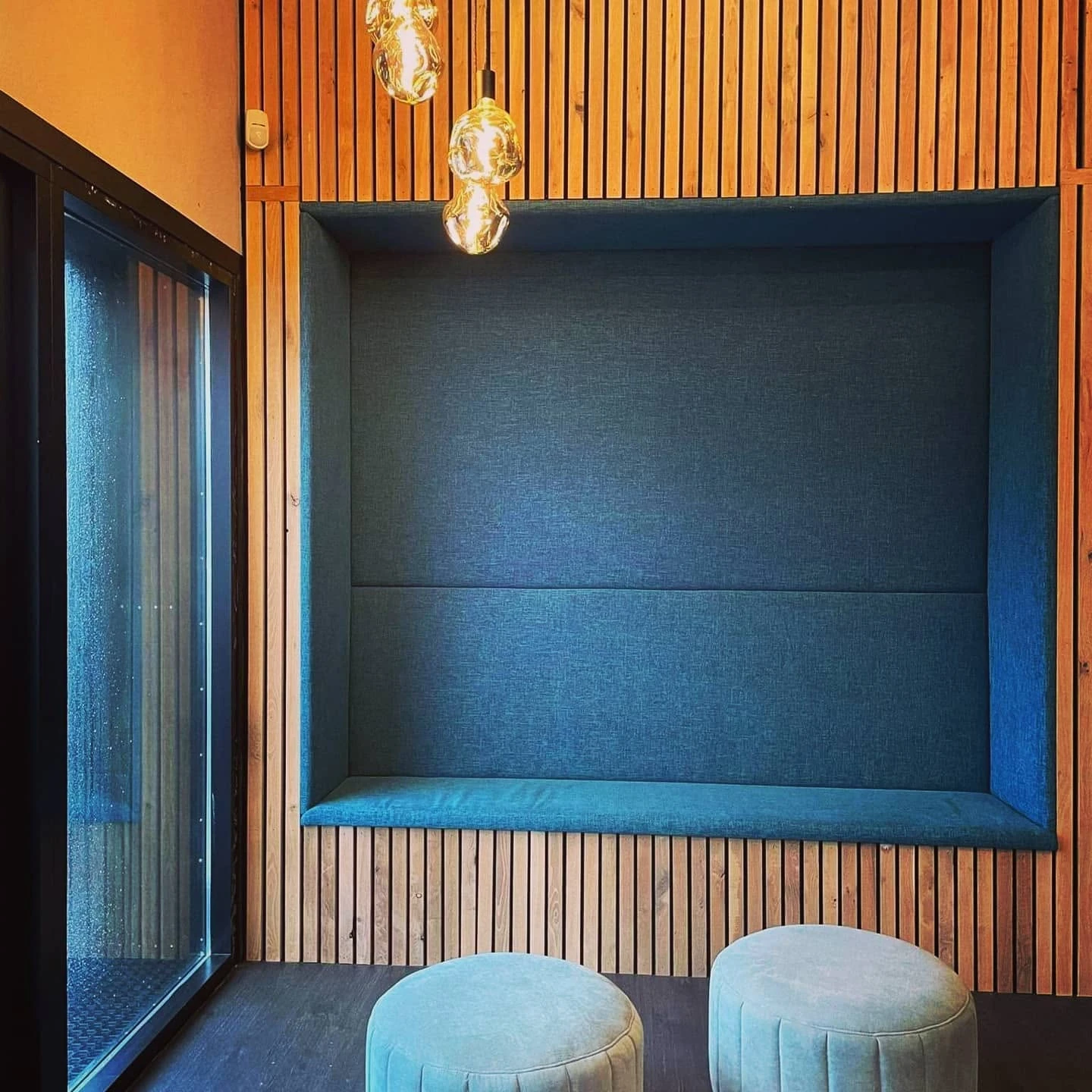
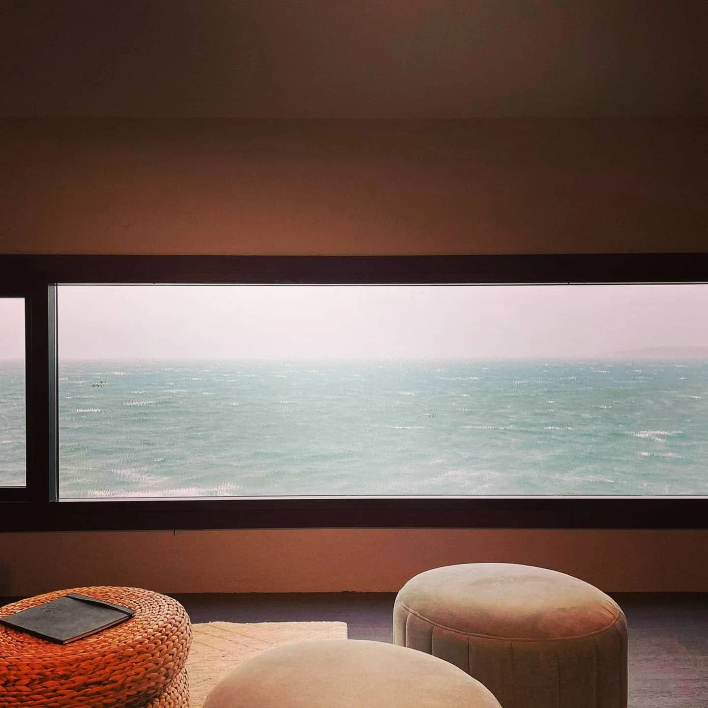
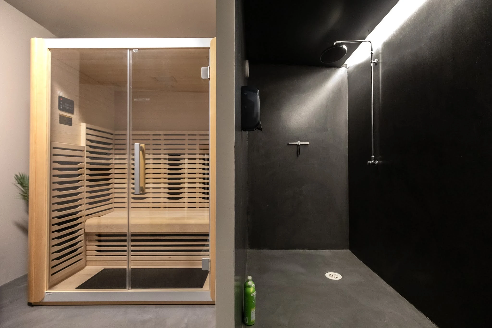
The installed mark meets warm timber and a teal seating alcove. Beyond the training floor, a sea-facing window and sauna show the quieter side of the setting: space to pause as well as move.
Visual identity and graphic design by Björgvin Guðjónsson. Identity artwork and application concepts from the supplied May 2020 logo guide. Location photographs supplied for this portfolio; interior architecture and photography are shown as context, outside the identity-design credit.